Cart
0
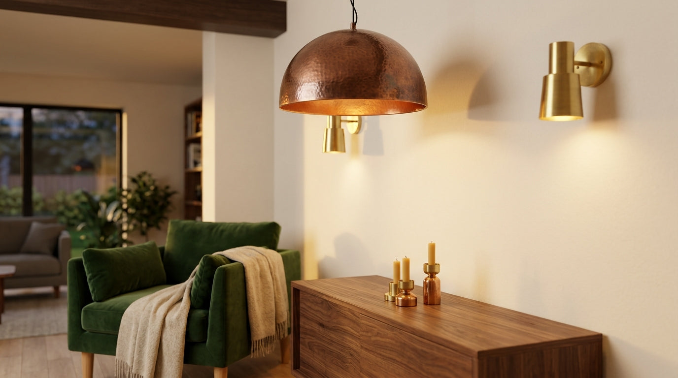
Brass and copper look like cousins, and that is exactly why they mix so well. Both carry warm undertones, both age with grace, and both add depth that painted surfaces cannot. Still, a careless blend can feel like a flea market. A few simple rules keep the mix intentional. Use these ten the next time you plan a kitchen, living room, or bathroom.
1. Learn the undertones first
Brass is an alloy of copper and zinc, and it leans yellow-gold. Copper is a pure metal with a reddish-pink glow. Hold a brass piece next to a copper one in daylight and the difference jumps out. Both sit on the warm side of the color wheel, so they get along. Cool metals like chrome and nickel fight them. Start with that shared warmth and the rest gets easier.
2. Choose one lead metal
Every good mix has a hero. Give one metal roughly 60 to 70 percent of the metallic accents in the room and let the other fill the rest. Brass often leads in living rooms, since its golden tone feels familiar. Copper often leads in kitchens, where its reddish warmth suits cookware and terracotta. Two equal metals compete for attention. One leader and one supporter cooperate.
3. Repeat each metal at least twice
A single copper vase in a brass-heavy room looks lost. Place each metal in two or three spots, spread across the space, so the eye travels around the room. A copper lamp base near the sofa and a copper frame across the room count as a pair. The same goes for brass. Repetition turns accidents into a plan.
4. Match the finish within each metal
Polished brass looks sharp next to polished copper. Aged brass looks natural next to antiqued copper. Mixing a mirror-bright finish with a dark, weathered one can look uneven. Texture works the same way. Hand-hammered surfaces pair well with other hand-hammered surfaces, because the dents catch light in a similar way. Decide the finish style before you decide the metal.
5. Give the metals a quiet backdrop
Warm metals shine against calm surfaces. Think cream plaster, walnut wood, white marble, or soft gray stone. Busy wallpaper and loud tile steal attention from the accents. Let the walls stay simple and let the metals add the sparkle. Good design needs one star per scene.
6. Layer your lighting by metal
Lighting offers the easiest place to mix, since fixtures hang at different heights. Hang a copper pendant light over a kitchen island, then add brass wall sconces on a nearby wall. The two levels separate the metals naturally, so neither fights the other. A brass table lamp on a side counter ties the layers together. Keep bulbs between 2700K and 3000K so both metals glow instead of looking flat.
7. Coordinate plumbing and hardware
Fixtures that touch water or hands matter most, because people see and use them daily. Pair a copper vessel sink with a brass faucet, or choose the reverse. Browse the brass sinks and bathroom faucets to see how the two metals sit side by side. Match cabinet pulls to the lead metal and use the supporting metal for one smaller detail, like a towel ring.
8. Add a cool color for contrast
Deep green, navy, and teal make both metals pop. These colors sit across the color wheel from copper’s orange-red and brass’s yellow, so they sharpen the contrast. A navy kitchen island with brass handles and a copper pendant looks rich and balanced. Soft white works as well, though it calls for more texture elsewhere. Pick one accent color and stay loyal to it.
9. Group small accents in odd numbers
Designers lean on threes and fives for a reason. Odd groups look natural, while even pairs look stiff. Line up three candle holders of different heights on a mantel, mixing one copper and two brass. A set of candle holders on a console table gives the mix an easy place to start. Vary height and width, but keep a common style, like all hand-hammered or all engraved.
10. Plan for patina
Brass and copper change with time. Unlacquered brass darkens toward bronze. Copper turns brown, then sometimes green, as it reacts with air and moisture. Lacquer slows that process on both. Decide early whether you love the aged look or prefer a bright finish, then buy accordingly. Wipe pieces with a soft cloth and mild soap, and skip harsh cleaners. A little neglect often looks better than too much polish. The same rule applies to hooks, rings, and other small fittings, such as the brass hangers and hooks that get touched every day.
Mixing metals feels risky only until you set a few boundaries. Pick a leader, repeat each metal, match the finishes, and let a quiet backdrop do its job. The room will look collected rather than cluttered. Warm metals forgive more than most people expect.
FAQs
Can you mix brass and copper in the same room?
Yes. Both metals have warm undertones, so they blend easily. Give one metal the lead role and use the other as a supporting accent.
How many metals should one room have?
Most designers recommend two or three. Stick with two warm metals, like brass and copper, for a simple look. Add a third only if you repeat it at least twice.
What colors go well with brass and copper?
Deep green, navy, teal, cream, and warm white all work. Cool, saturated colors create the strongest contrast, while neutrals keep the room calm.
Does copper tarnish faster than brass?
Copper often darkens and shifts color faster, especially in humid spaces. Unlacquered brass tarnishes too, just at a gentler pace. Lacquer slows both.
Should brass and copper finishes match?
Keep the finish style consistent. Pair polished with polished, antiqued with antiqued, and hammered with hammered. Mismatched finishes can make the mix look unplanned.